Harvard Business Review
Reinventing the HBR mobile app for the next generation of business leaders
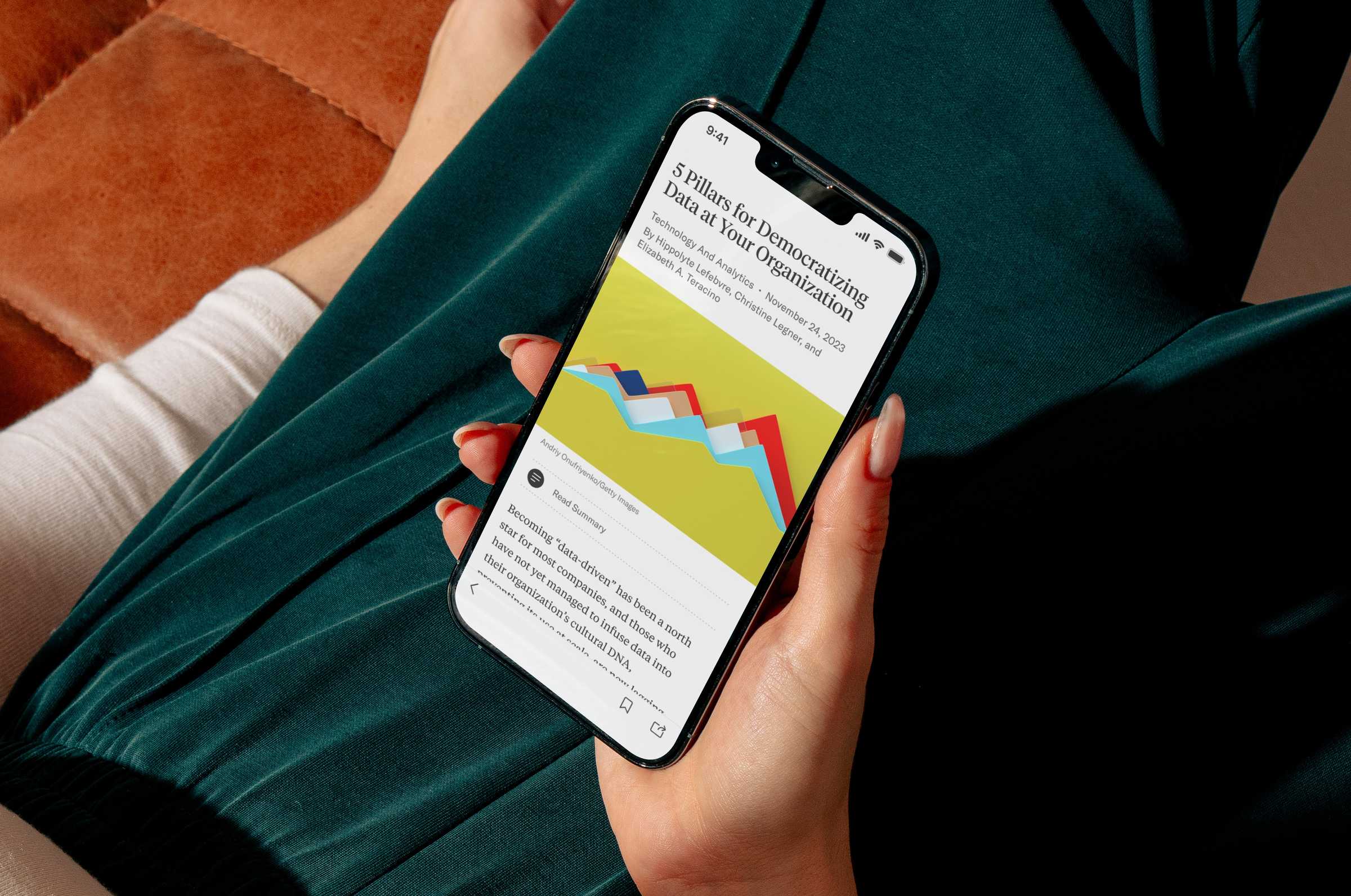
The Harvard Business Review knew the time had come to overhaul their mobile app. The goal was a full re-envisioning of the experience to engage a younger audience and align the look and feel of the app with the HBR brand.
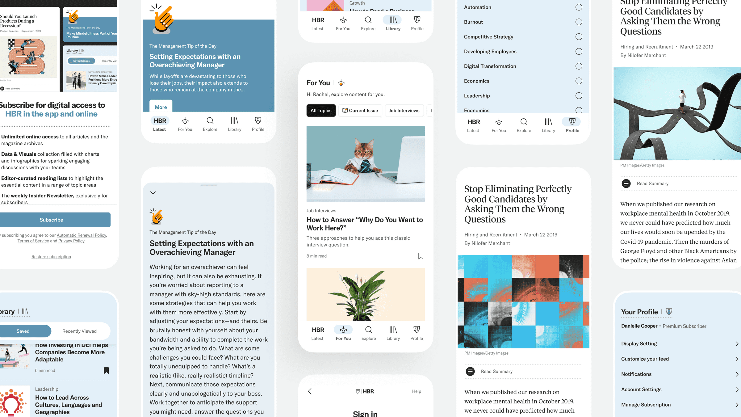
How it started
The Harvard Business Review called on thoughtbot, the agency where I work, to help them build a new mobile app with a clear objective—design a new app that was worthy of the HBR brand. An MVP that didn’t look or feel like an MVP.
We knew we had to nail the fundamentals of a media app with features like browsing and reading articles, but we wanted to also make sure we could engage with the audience in a way that was personal and habit-building.
The journey
Designing and building great products is never a straight line. In my role as the lead product designer on the project I had a number of responsibilities through the twists and turns of the project. I led a design sprint, ran user interviews, orchestrated the UX of the app, collaborated with the HBR design team on the UI, and even jumped into code. This was a team effort every step of the way. I worked closely with another thoughtbot designer, two HBR designers, and a talented team of developers and product managers.
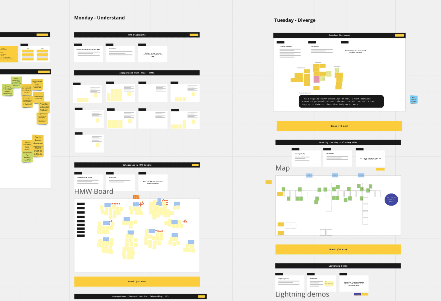
In the first week of the engagement between thoughtbot and HBR, I helped run a design sprint that allowed us to quickly explore ideas and align on a vision for the new app.
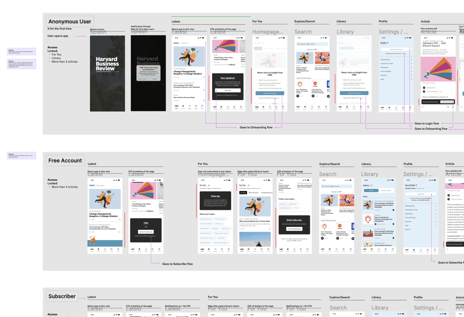
We prototyped and user tested early lo-fi designs to better understand the features that were important to users.
User testing provided invaluable data that caused us to rethink our assumptions about what features would be valuable and how to structure the app. We iterated on the design of the app as we gathered more data from user testing.
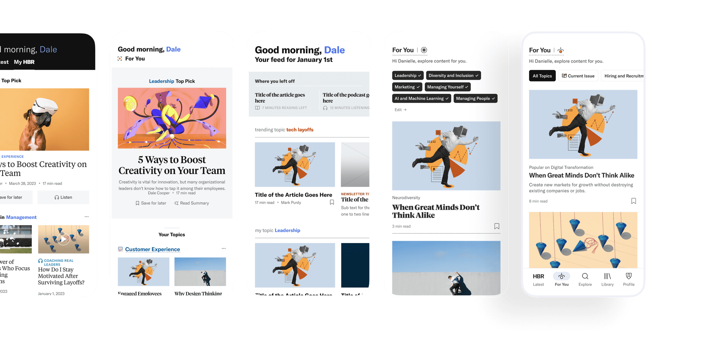
As the lead product designer, I proposed a structure for the design team that catered to everyone’s strengths and allowed us to work effectively. The HBR designers owned the UI since they knew the brand in and out, and the thoughtbot designers owned the UX. We collaborated often to share ideas and eventually integrated our work into a single product vision.
To help ensure the app would be well supported in the long term, I was also able to mentor one of the HBR designers who took over the product design responsibilities once our engagement was over.
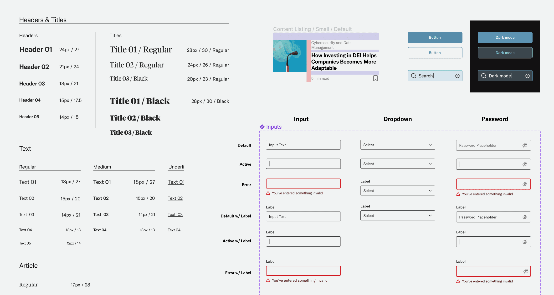

As the design was refined, components and styles were added to Figma to keep everyone aligned and help with dev handoff.
The thoughtbot designers also jumped into the React Native code to help developers refine UI details and close the long feedback loops that often exist between design and engineering teams. This allowed us to move faster while still upholding a high visual quality.
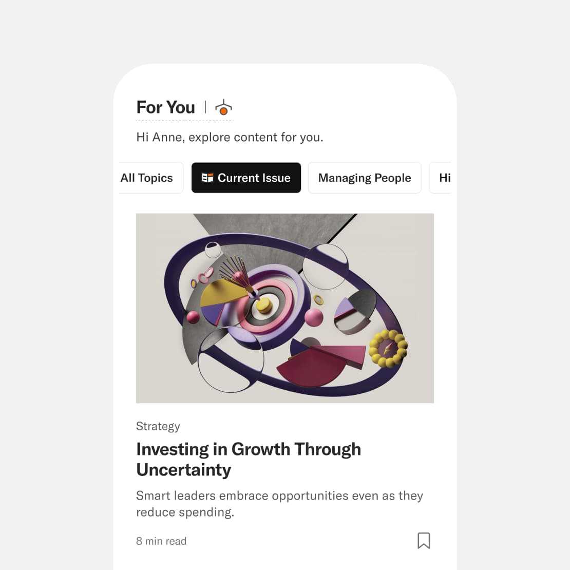
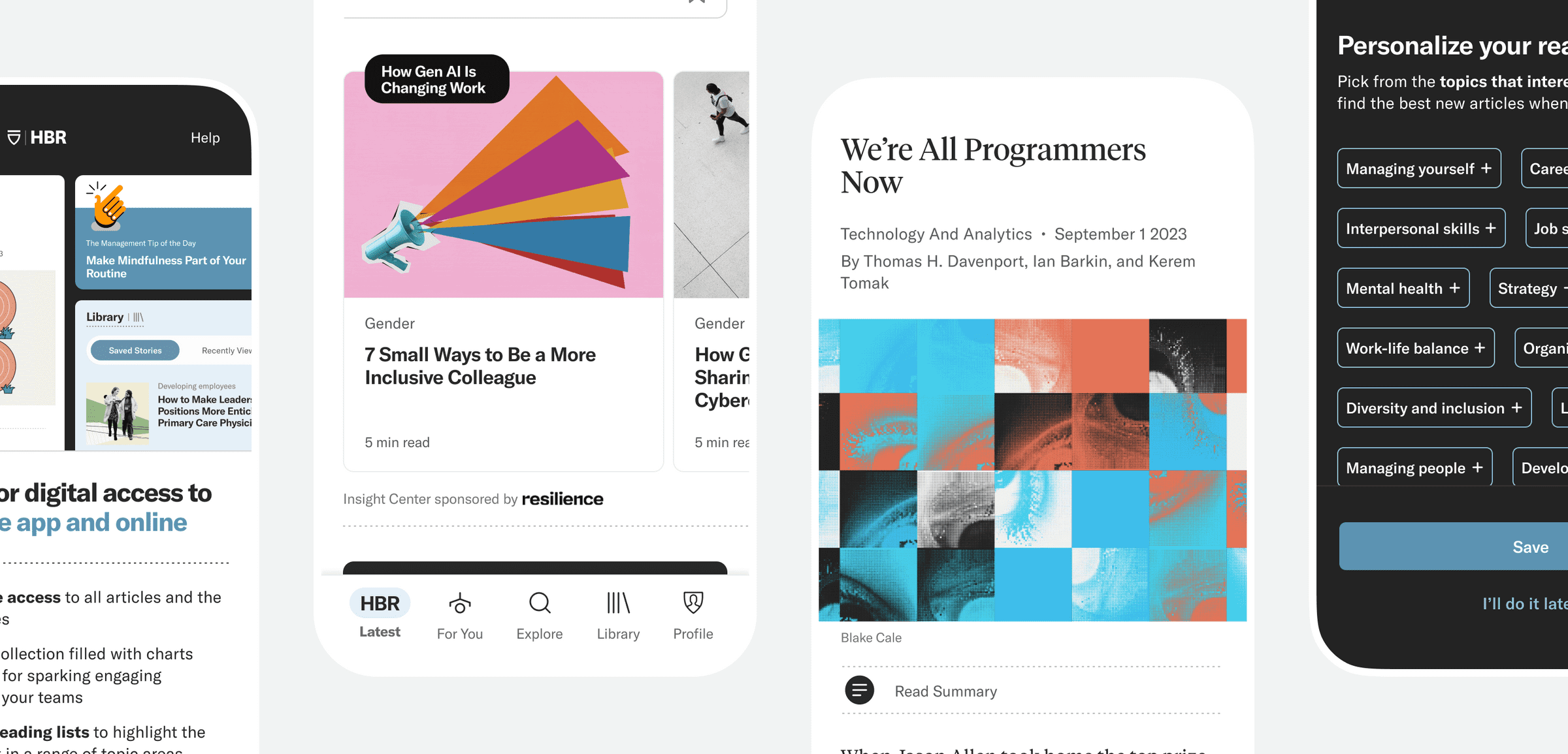
The For You feed contained content from topics chosen by the user along with a special callout for content from the current print issue of the Harvard Business Review.
To engage users on the go, short-form content such as the popular Management Tip of the Day was highlighted in the latest feed.
Editorial-style typography and unique content modules added variety to the feeds and helped organize HBR’s extensive content library.
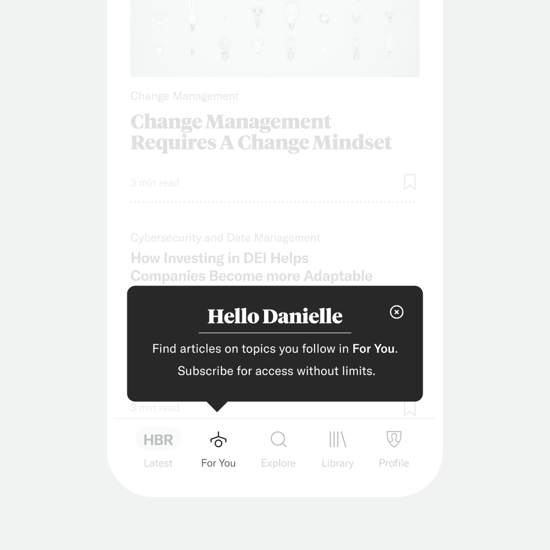
Personalized messages guide users through the unique features of the app, including the personalized For You page.
Results
In less than a year we went from a rough concept to launching in the Android and iOS app stores! We were able to deliver an MVP that doesn’t look or feel like an MVP. Feedback from the HBR team was extremely positive as we helped them not only launch a great app but also mentored their team.
When I look at the product right now, it's polished and complete, it sets a high design standard. I understand some things are not perfect but in comparison to what I was assuming, this is so much more polished and done and complete.