YoPortfolio
A startup investment product needed a playful brand and UI design to launch them into the future.
A local entrepreneur came to the team at Sparkbox with a dream for a new investment product called YoPortfolio. The product would help investors track their trades and know if they were beating the market. His bold vision, mathematical formulas, and quirky name was all we needed to get started!
I served as the brand and product designer for the project and used my understanding of design and development to guide the client in cost-saving decisions that still resulted in a great brand design and MVP product.
Brand Design
To begin, the product needed a brand identity that would attract the target audience of tech-savvy at home investors. It also needed to reflect the vision of YoPortfolio, a simple and easy to understand product that was casual yet trustworthy, friendly and approachable.
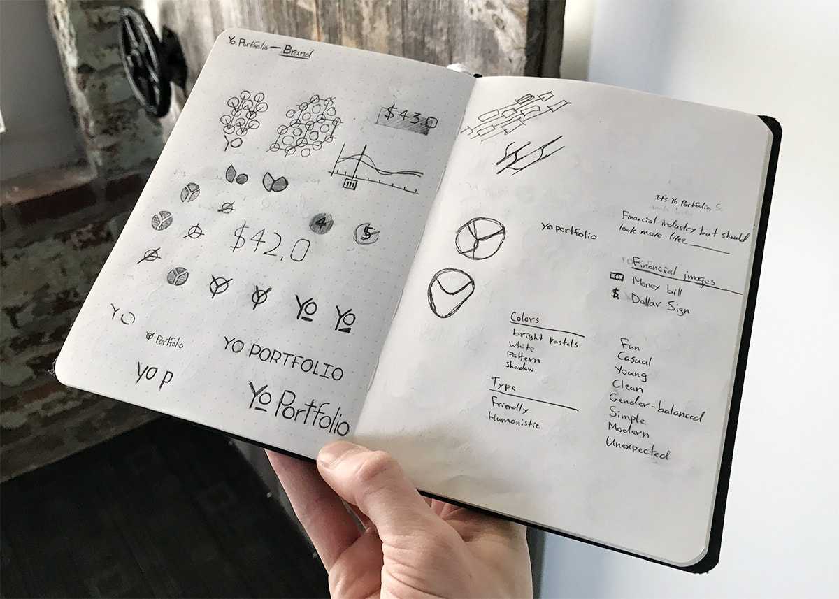
Sketches
After listening to the client's vision for the product, I began by sketching a variety of potential directions for the logo.
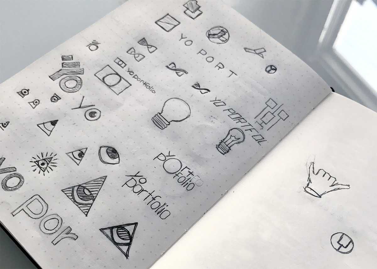
Brand Design Explorations
Explorations were varied and covered a number of visual styles and potential directions for the YoPortfolio brand.
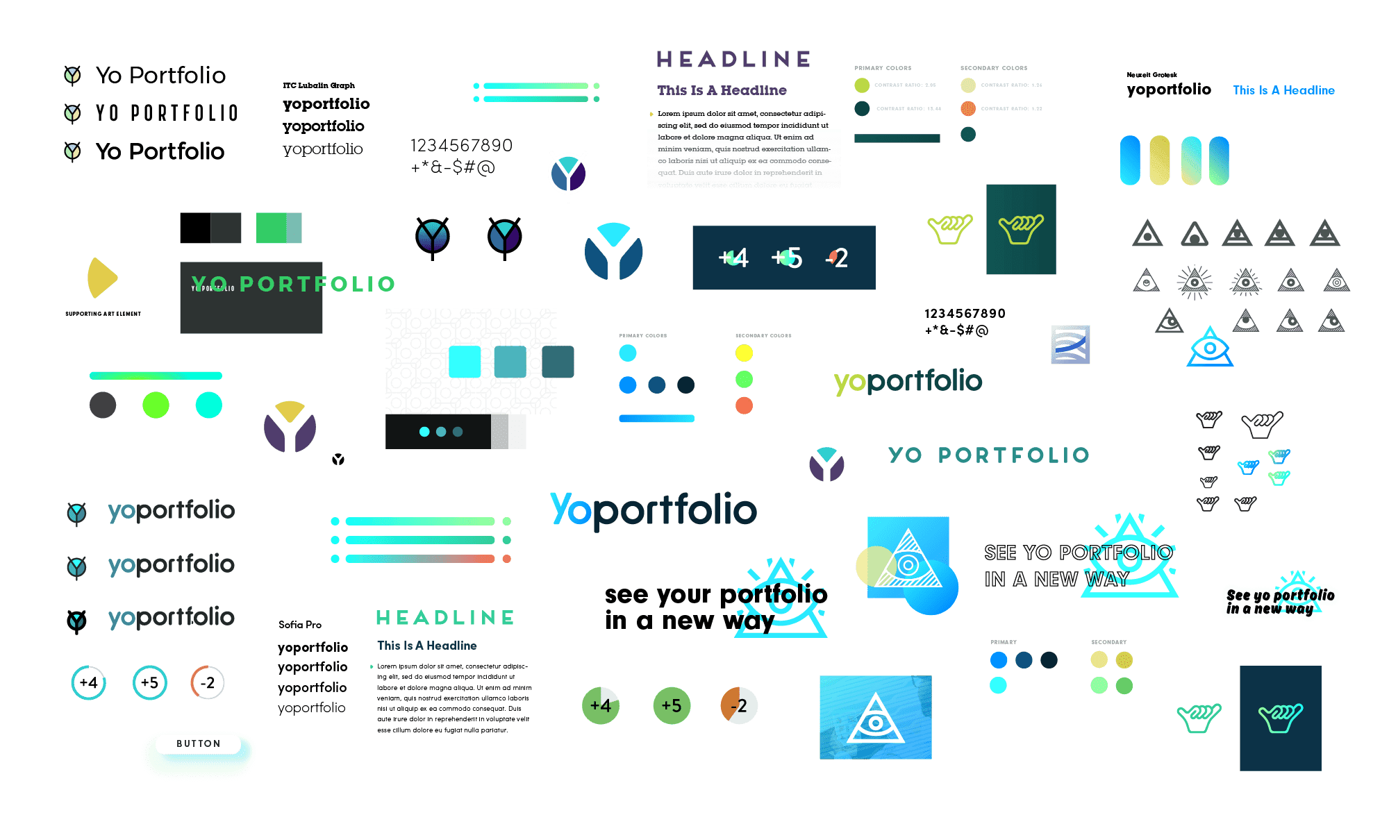
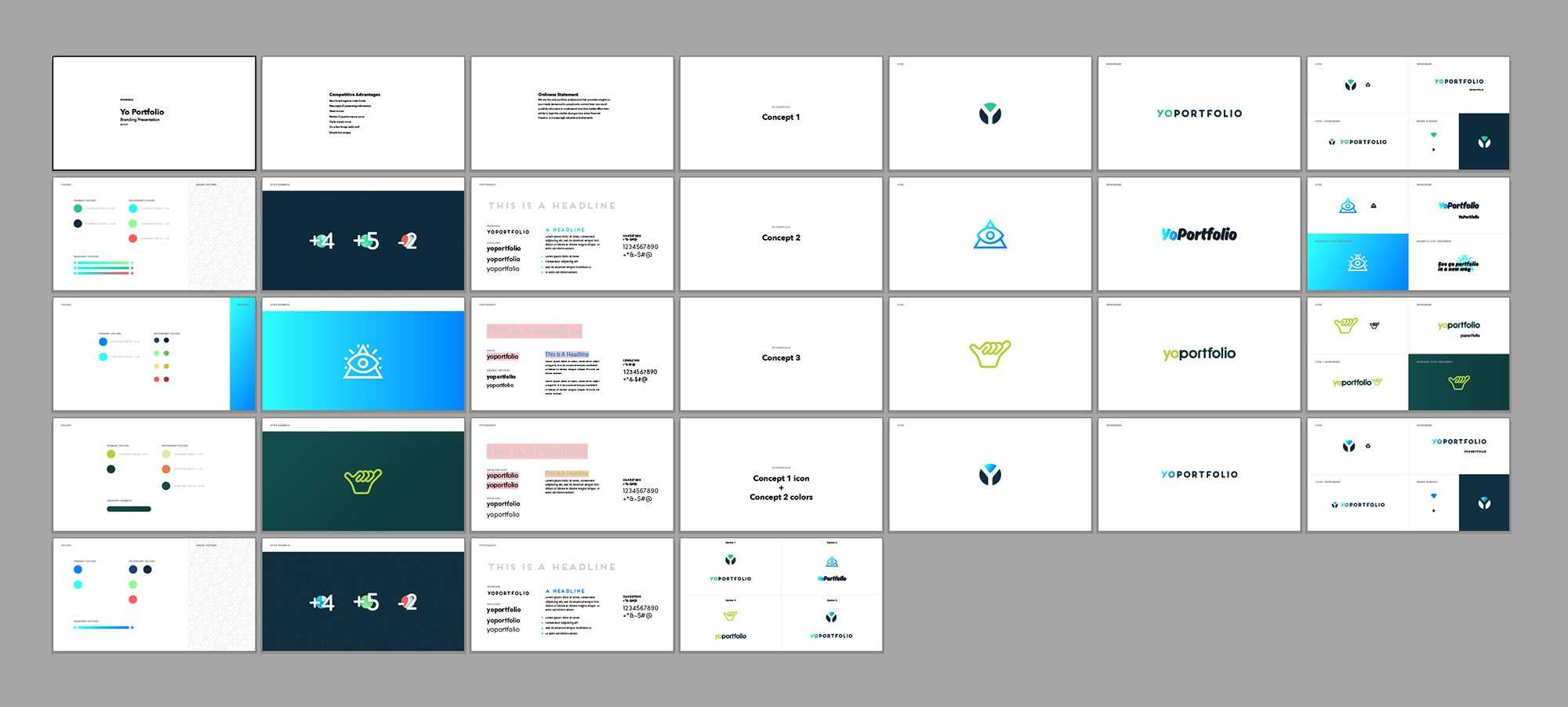
With feedback from Jeremy Loyd, Creative Director at Sparkbox, we arrived at three potential visual directions which I presented to the client for feedback.
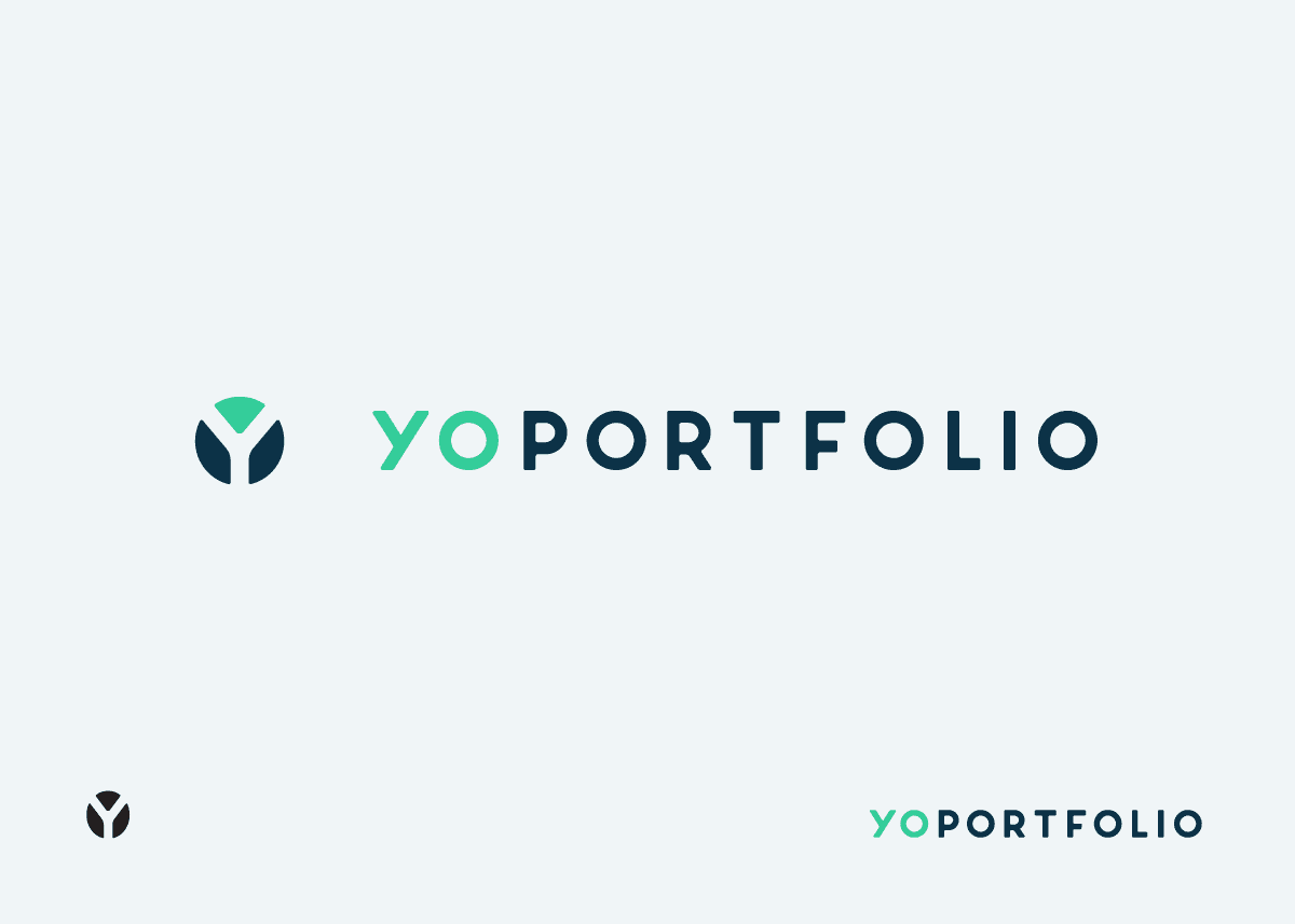
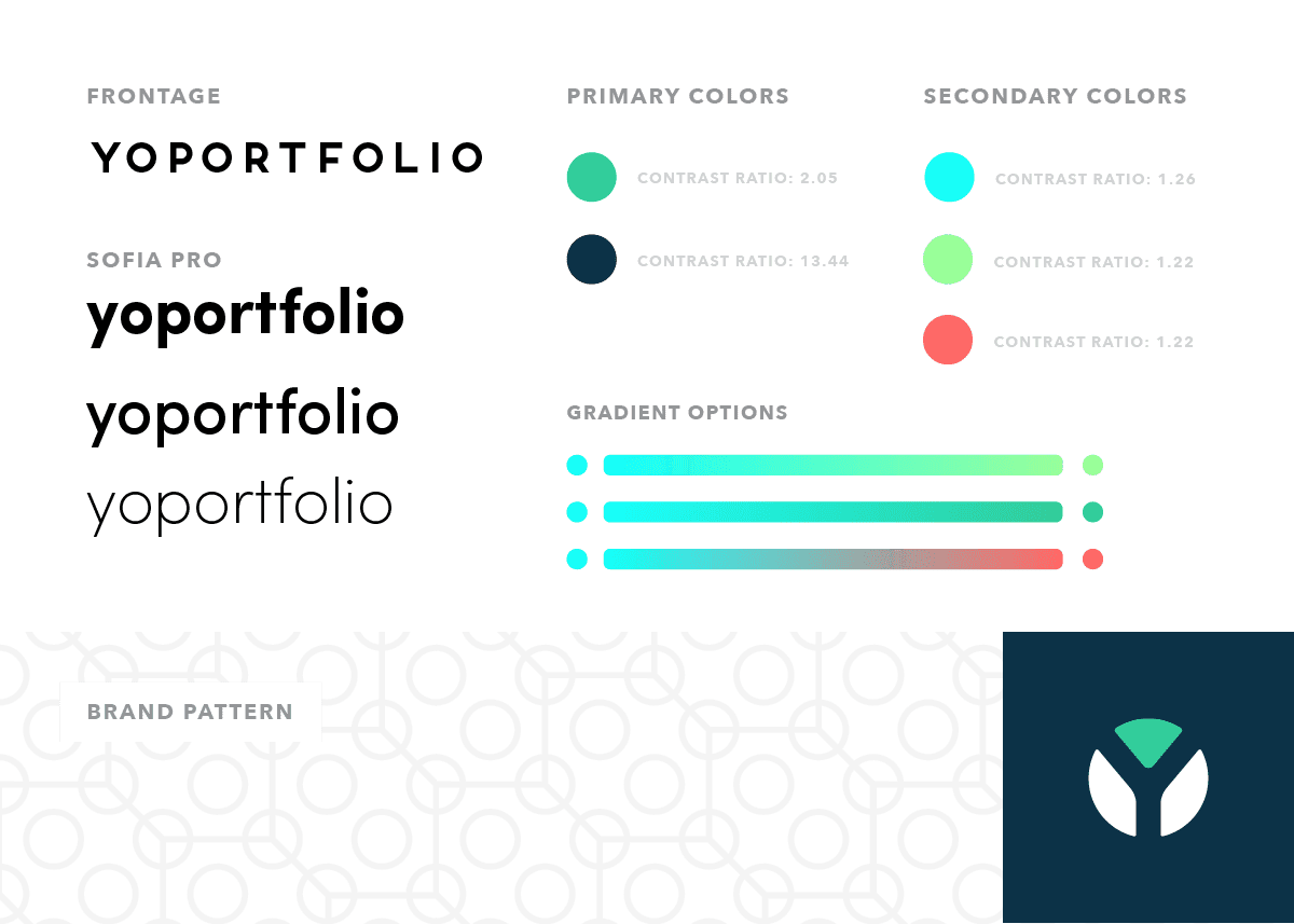
Final Logo
In the final logo, a simple icon references a pie chart and the "YO" letters of YoPortfolio. The color palate emphasized the balance between tech and finances found in the product while also being mindful of digital accessibility requirements.
UI Design
Now that we had established a visual identity, it was time to apply that identity to the product. After wireframes were created by the team at Sparkbox, my responsibility was to design a clear, engaging, and easy-to-use interface.
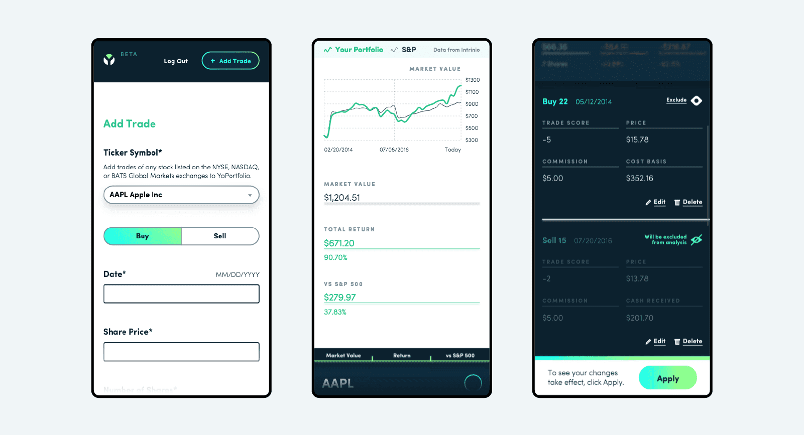
To give users flexibility to access YoPortfolio on any device, it was built as a web product, as opposed to a native app. Therefore, the interface needed to be responsive and work just as well on desktop and mobile displays.
It was important that the UI not be too difficult to build and risk putting the project over budget or delaying the launch. I used my knowledge of HTML and CSS to design an interface that would balance users needs with development complexity.
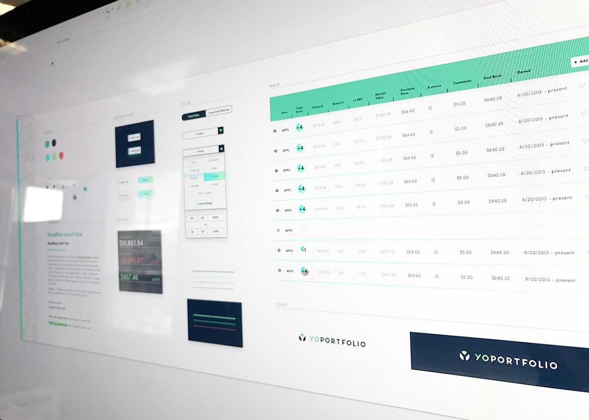
Element Collage
Before diving into layout design, I created an "element collage" to explore how the brand would look when applied to UI elements. This allowed us to get buy-in from the client on the visual direction before considering the user experience.
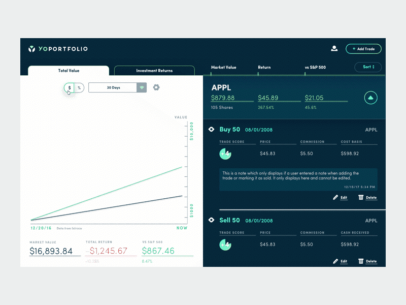
UI Design Process
The single screen product needed to show a graph of the user's portfolio compared to the market and a listing of their stocks.
Over time, the UI evolved to a more simple layout with a focus on colors to tell the story of how a user’s stocks were performing.
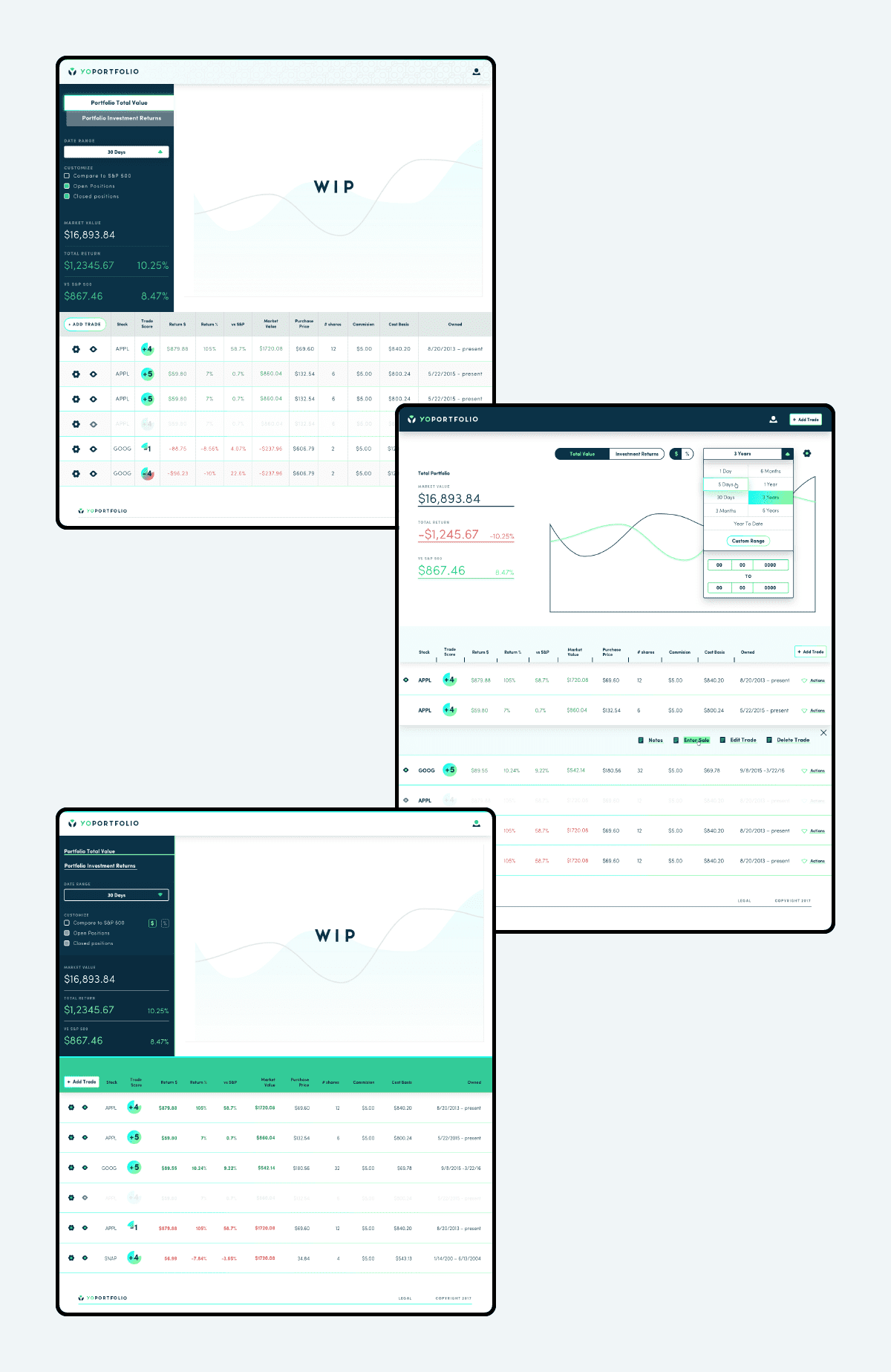
Final UI Design
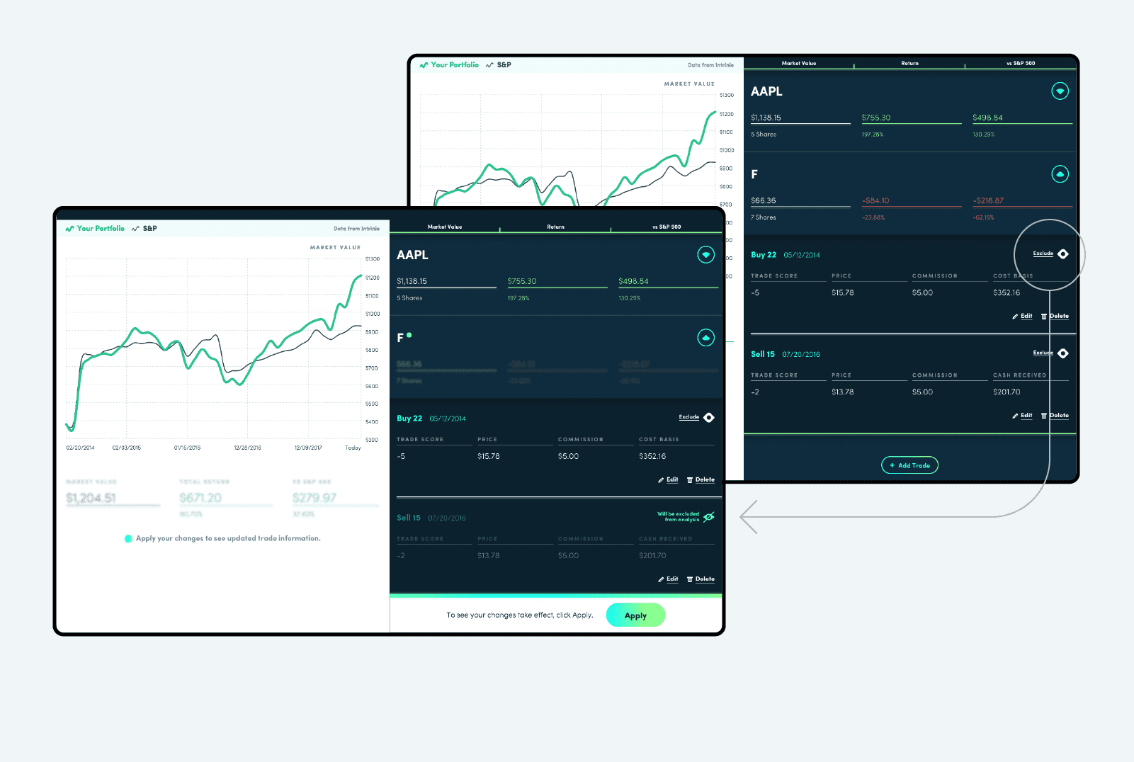
We ultimately landed on a split-screen design with a chart on the left and a list of stocks on the right. This improved the experience by allowing users to hide and show stocks on the right and see the chart on the left change in response.
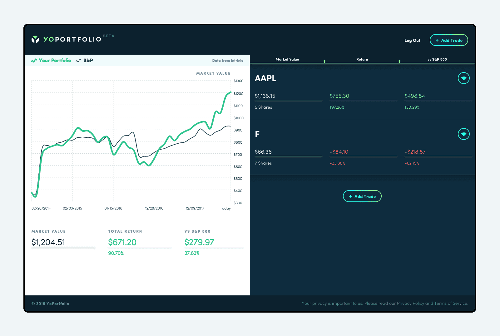
Being a very interactive web application, special attention was given to the various user flows and different states of the product. I was able to jump into the code and help the development team tweak the look of various components. I also designed and built many of the animations that were used to communicate the user's actions.
The simplicity of the interface lent itself well to mobile displays as well with the chart displaying above the individual stocks.
Launch
YoPortfolio launched as a beautiful, and fully functional MVP application! The client was very happy with the end result and was able to onboard new users and get buy-in for more funding and future improvements.